Ronina, Shingle Street review
– on the beach, all MoD cons
A no-frills Ministry of Defence house on a dead-end stretch of Suffolk coast has been given beguiling new life, chiefly by using what was already there
Iam looking at a ceiling in which rough wooden joists are sloping this way and that, their galvanised steel hangers on view, between them plywood whose patterns of grain and knots don’t match from one panel to another. “Kaleidoscopic” is how it is described to me. It is updated Tudor, timber structure made manifest. It looks complicated for a bedroom about 3 metres cubed, but the ceiling has a simple explanation. It is the inverse and necessary support of two pitched roofs that intersect overhead.
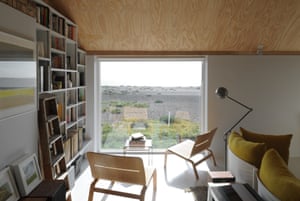
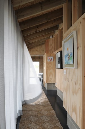
From this room, a glass-walled corridor points, through a large-windowed living space and over drifts of shingle, to a horizon populated by slow-moving container ships and a just-visible array of wind turbines. Southern light enters through the side. Along the axis other construction materials – concrete block, plaster, steel that was never meant to be seen, odd bits of brick, more plywood – generate surprisingly subtle rhythms of colour and shade. Their pinkish-greyish-beige range finds sympathy with both the pebbles outside and the mid-century furniture inside.
This house, a retreat for a London-based couple, is not a space of public importance, spectacular appearance or even radical design. I am there because I encountered some photographs of it in the studio of some enthusiastic young architects, and saw what even an architectural critic doesn’t get to experience enough, which is space, light, surface and construction arranged with thought and purpose to magnify the life that goes on in and around a building. Architecture, you might say.
The house, called Ronina, has another attraction: its creative embrace of the already-there. Almost any construction project has, in its location, intended use and ways of building, unique and irreplaceable resources that can either be obliterated in the cause of making a statement, or used to make something that couldn’t happen anywhere else. These resources are ultimately human – whether the actions of the builders, the desires and needs of the users, or interventions on the setting by people in the past.
Here, the setting is Shingle Street, a provisional, fragile-seeming hamlet on the Suffolk coast, whose singular history has been recorded by a local historian, Tim Miller, in his book Life on the Edge. It doesn’t bother with the formalities of village green, paved street or parish church. Its main landmark is a Martello tower built to ward off Napoleon, a masonry cylinder at the opposite end of the solidity spectrum from the driftwood shacks improvised here by people who eked a living from the sea. WG Sebald, bard of the barely there, called it “the most abandoned spot in the entire region”. It is a “cul-de-sac, a dead-end track”, says Blake Morrison’s Ballad of Shingle Street, “a sandbanked strand to sink a fleet… the sea out front, the marsh out back”.
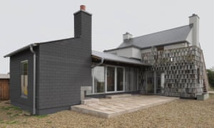
During the second world war, Shingle Street was evacuated so that the military could mine the beach and use the houses for target practice. Ronina was one of a clutch of homes built by the Ministry of Defence in the 1950s to re-house those displaced. It had the lack of frills and, indeed, comfort – no insulation, for example – that one would expect of that agency at that time. The obvious path would have been to demolish and rebuild. It was the one not taken by the architects Sam Casswell and Alex Bank: rather, they made good its deficiencies and added an extension on the landward side.
They ended up with a loose, gawky gathering of what they call “characters”, something like the ad hoc sheds and additions that get thrown up round here. The old building is a basic house shape, as in a Monopoly set or an old logo for a building society: box-plus-roof, made abstract with spare-framed windows adjusted to catch the view, and new insulating cladding in an “ozone-y” greenish-grey. An old toilet attached to the back, now a kitchen, is enveloped in grey shingles (wooden, tile-shaped elements, that is, not pebbles) cannibalised from a fence that used to surround the site. A new extension, with the corridor and the complex ceiled bedroom, is clad in black bitumen shingles.
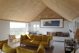
Inside, the old is edited and augmented. The concrete ceiling of the old toilet, gnawed by partial demolition, looks archaeological. A 1950s tiled fireplace survives. What was a warren of upstairs bedrooms has been knocked together to make a single sociable room, poised to capture views and light, opened up to the undersides of the sloping roof, and with new plaster on the walls stopping in time to reveal triangles of Fletton bricks, the most basic the 50s MoD could find.
The whole is guided by the way the owners move around the house through the day, inside and out, to catch sun and shelter from wind. It is open to the public paths that go round it, such that it is part of the life of the village, while also enjoying privacy when needed. It is built with the same spirit that almost everyone has when we pick up stones, driftwood and sea grass, fascinated by the way that the physics of the land change when one gets close to the sea.
The Shingle Street house is also artful – a matter, as its architects say, of knowing when to control and when to leave alone. Casswell, who spent five years of his life perfecting the detail on the ornate stair that Caruso St John installed at Tate Britain, knows something about precision. You can see this sensibility in intricate interlockings of found and designed materials, of block, ply, wood, paint, brick and uncovered structural steel. Haphazard or happy-go-lucky it is not.It is not new, this interest in taking things as they are and taking the design from there. The Californian houses that Frank Gehry designed in the 60s and 70s, before he was world-famous, drew on the hidden riches of basic construction. Casswell Bank acknowledge the influence. The architects Caruso St John, for whom Casswell used to work, launched their career in the mid-90s with a London house that relished the decayed bricks and paint of its former life. Since, however, the truth that design doesn’t start with nothing keeps being forgotten, there is value in re-enacting it.
It could be a modern cottage orné, an update of Marie Antoinette playing peasant, a dissemblance of what is plainly an export of metropolitan culture. But it doesn’t feel like those things, because the concrete and plywood are not revealed for the sake of stylistic gesture, but because that’s what seems right for their time and place.
.
.
.


No comments:
Post a Comment