Futures Forum: Building Hope: The Maggie's Centres
This piece from the Observer last year looks at how wood can transform place and so make 'places of calm':
Maggie’s cancer centre in Oldham: a balm for the senses
This, the 21st of the cancer centres begun by Maggie Keswick-Jencks, stays true to the group’s founding mission to create spaces of calm and light to help support patients and their families
If you’re lucky enough not to have had chemotherapy, you may not know much about one of its side-effects, neutropenia. Among other things, it can make it unpleasant to touch the cold surfaces common in hospitals or the standard grab rails and handles, in thick white tubes of steel or plastic, which are ubiquitous in disabled lavatories. Even if you don’t have this condition you might still dislike the insistent message of this paraphernalia: YOU ARE ILL. YOU ARE DISABLED. YOU MUST THEREFORE LIVE IN A WORLD OF UGLINESS. Even if you are able bodied and healthy, you might express a suppressed wish for a little sensory delight in the parts of a building that you touch.
But a voice will tell you that you can’t expect anything better, that you are in a place of medicine and this is how things have to be. Unless you are in the new Maggie’s cancer centre in Oldham, where the architects dRMM have found a way to make these small necessities out of wood. It has a modest but profound effect in achieving the calmness the building seeks. It makes what is usually an assemblage of equipment into a space.
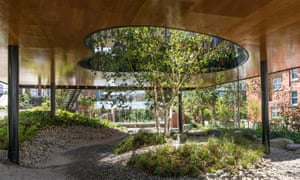
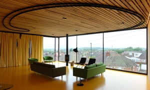
The Pennines, on the other hand, are quite big. The centre offers a grand view of them and their shifting cloud shadows through glass walls, as if from a millionaire’s villa, over the low roofs of Oldham. “You get hope in a horizon,” says Alex de Rijke of dRMM. Between the mountains and the handles comes the centre’s most arresting moment – a court piercing the building, walled in wavy glass like a giant Alvar Aalto vase, in which grows, like a flower in that vase, a birch tree.
This is the 21st centre in the 21-year history of Maggie’s, the programme conceived by the writer, artist and garden designer Maggie Keswick Jencks when she was dying of cancer. The idea is to offer support, advice and camaraderie to cancer patients and their families, supplementary to their medical treatment. Fundamental to the concept, provoked by the dismal hospital corridors and rooms in which Jencks had to spend terrible and momentous days, is the idea that the centres should be beautiful buildings. Some of the world’s most famous architects, from the same cast that provides Pritzker prize winners and designers of the Serpentine Gallery’s annual pavilion – Frank Gehry, Zaha Hadid, Norman Foster, Richard Rogers, OMA – have provided their services, usually for no fee, to Maggie’s.
This premise – that a beautiful space enhances wellbeing – is admirable and inarguable. What’s proved more of a non sequitur is that such a space will be best provided by denizens of the Pritzker-verse, who have built their fame on museums and skyscrapers. There’s something to like in every Maggie’s centre I’ve seen, and the calm and intimacy they seek, but sometimes these qualities exist despite and not because of the signature gestures with which the famous architects want to let you know they’re there. Maggie’s doesn’t like to talk about the budgets of its projects, but it’s obvious that this “starchitecture”, pro bono zero-fees notwithstanding, doesn’t come cheap.
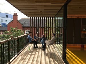
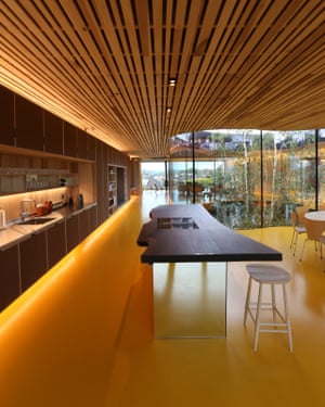
dRMM are not going to win the Pritzker, although it’s hard exactly to put your finger on what they lack that some winners have. It would be tempting to say that they bring a lack of ego to the centre, but there’s a healthy amount of that. It’s more hyper-thoughtfulness, playful functionalism and an attention to the matters in hand that persistently looks beyond the standard solutions. The colour of reflected light was considered, because the wrong choice would make skin tones affected by cancer treatment look more unhealthy. There is a balcony with a deep overhang above, because after radiotherapy you usually don’t want direct sunlight. There are cork panels on cupboard doors to soften the acoustic and off-cuts from the timber structure have been made into a big circular table.
Set in the grounds of the Royal Oldham hospital, and paid for by a local benefactor Sir Norman Stoller, the building first presents itself as a plain timber box, lifted on stilts – again, like a modernist villa – above and next to a garden. It is discreet, and will be more so when some trees have grown, but just by being wooden it’s already different from the shiny, you-don’t-quite-know-what-they-are materials of which hospitals are usually made.
Entering through a domestic-scaled door, you’re unprepared for the bright, yellow-floored room you find; Pennines to the right, tree in a vase straight in front of you, a kitchen and shared table, always an essential part of a Maggie’s centre, to the left. The space is otherworldly but not alien. It could be bewildering, the last thing a Maggie’s wants, as it aims to be welcoming to people who might be shocked by their diagnosis, but the pull of the space brings visitors further in. It is open, but also allows degrees of quietness and solitude. “Sometimes, people tell you their greatest fears in an open space,” says Bernie Byrne, the centre’s head. “They don’t have to make eye contact. They can look beyond you to something else.”
Running through the project are yet more decisions born of questioning and opportunity – it could be a mess, but they are somehow coherent and contribute to the wholeness of the place. An unusual piece of American walnut was spotted online before construction started, reserved and made into a worktop. The rubble of the mortuary that used to stand here is made into a landscape out of which pioneer species such as the birch grow – “the first to come back after a disaster”. The structure is in the now commonplace cross-laminated timber, but for the first time made using a hardwood, American tulipwood, which makes it more efficient and better looking.
The best of these moments responds to the need to make the open space more private, for yoga classes for example. A big, heavy curtain by the textile designer Petra Blaisse can be drawn along a looping track to make a room within a room, a soft lunar module with transparent circles for views outside. The fabric is mossy and yellowish on one side and silver and shiny on the other and depending how you pull it you can get either surface facing you. It’s practical, but it’s also pure joy. It is like the most beautiful hospital curtain you have ever seen.
De Rijke’s girlfriend, Lucy Steed-Fassett, suffers from cancer, and much of the design is based on her experience and advice. They both know too well the medical spaces that Maggie Keswick-Jencks hated – “environments of plastic, sitting in a plastic chair, PVC flooring which is of course toxic, paints which are often plastic, and steel and plasterboard which are carbon-intensive… strip lighting, horrendous daylight and vending machines full of sugar.” His fondness for wood is an antidote to all this sensory poison. “In wood there’s hope,” he says. He’s right. Every hospital should have a space like this, for people affected by every kind of disease.
.
.
.


No comments:
Post a Comment